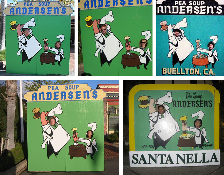
It doesn't matter how many times we visit Andersen's Split Pea Soup on the way to or from LA. We have to stop and take a picture of the sign board with two heads sticking out of the holes.
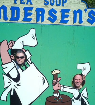
I suspect it’s been this way since the 50s. It never gets old.
In the same way, there are certain things in design that, no matter how tempting it is to try and come up with something completely new, it’s nearly always better to use something familiar.
A wonderful writing teacher once read our class the intro to a story about a girl meeting her new roommate at college. The girl was nervous, the roommate seemed odd or alarming. It was humorous and well-written, vivid. The teacher asked “Does this feel realistic?” and everyone thought it did. Then he asked if we could predict what would happen, and most of us thought we could, or at least we could come up with a few likely ways the story was likely to go. Good writing has to be both surprising and predictable. The exact proportions are the art, but you need both elements.
In the same way, design has to surprise and delight you, but it also has to be familiar enough to use easily. We need to know where the headline is, what the page is about, how to take basic actions we might want to take. A menu can be cool and interesting, but has to be familiar enough to be used as a menu.
This changes over time. Trends introduce new “normals” that we can play with and push the boundaries of. But to make a design work, we have to know the boundaries and work with the expectations, and needs, of our users.