Who are your website visitors, and what do they want?
At the most basic level, websites need to offer easy, clear access to relevant content, or visitors will quickly leave.
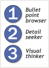
Of course not all people are the same, and the same person can be in different “user modes” depending on her needs and focus right then. But a good website can accommodate at least three types of user:
Bullet point browser
This person’s in a hurry, and they want the overview fast and simple. Most users are in this mode until they’re sure they’re in the right place. Give them:
- Clear navigation and headlines so they know what the page is about.
- Bullet points for main concepts and key options.
- Pullout quotes, summary text, captions for quick hit information.
Detail seeker
Once users find a page that interests them, they focus more on the content. Offer:
- Comprehensive, well-organized text that emphasizes benefits to the reader.
- Appropriate links and next steps that offer more detail and keep the interested user engaged.
Visual thinker
Some users rely more strongly on visual clues to assess your organization. Grab their eyeball’s attention, and their minds may follow. Provide:
- Visual elements that reinforce the content and emotional tone of the message.
- Subtle visual metaphors and fun extras that will communicate to this users subconscious.
- Alternative ways to navigate that involves clicking on pictures.
- Content presented in video or animation format.
Whether your site visitor is a bullet point browser, a detail seeker, or a visual thinker, make sure your website addresses those needs.


