A magazine-inspired layout uses disciplined limits to create a flexible portfolio.
Of course on the one hand, showing beautiful photos of client work is easy. Make the photos big and keep the design out of the way. Done!
But a website has to be built both to accommodate unanticipated situations and to make it easy to keep a uniform look and style.
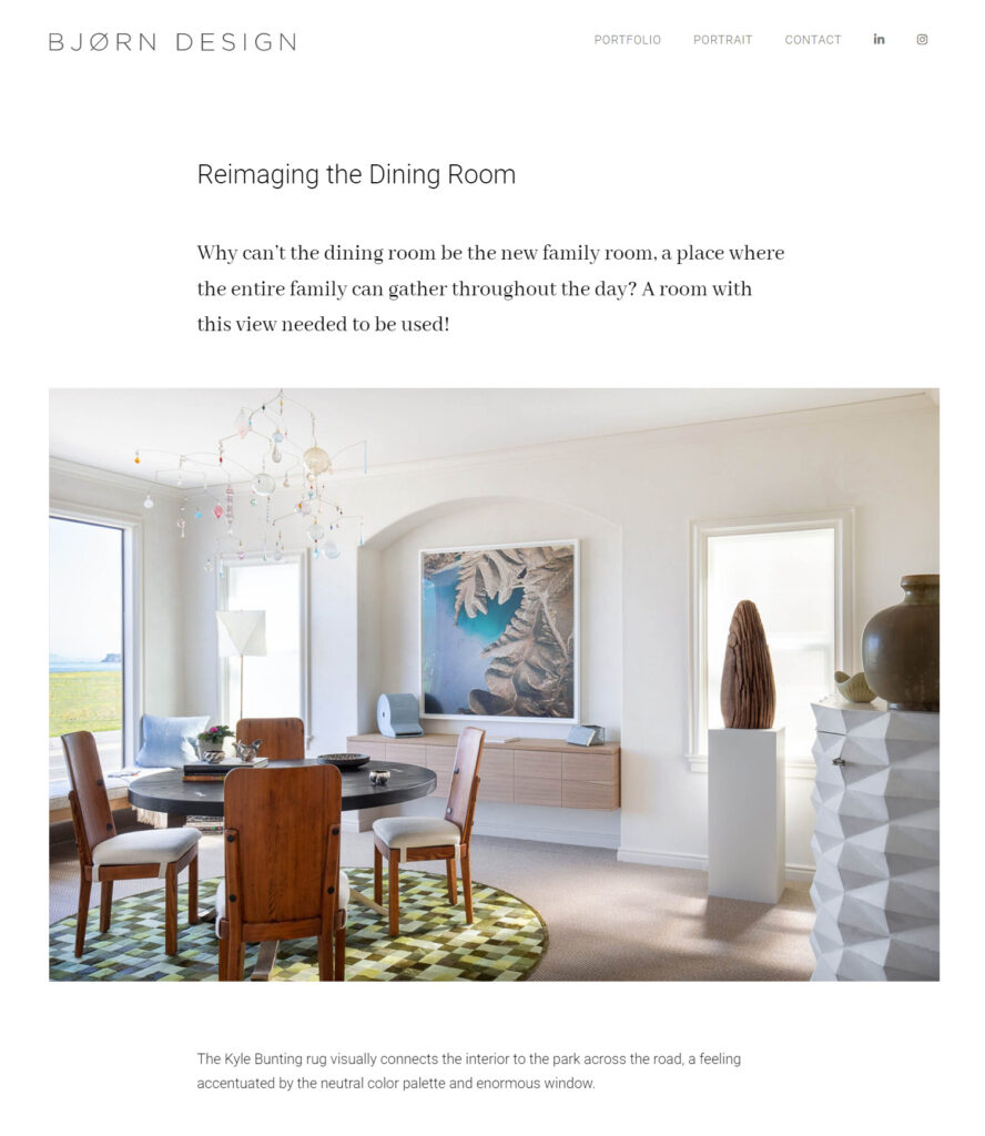
For San Francisco Interiors firm Bjorn Design, the goal was a magazine-style layout that allowed each page to tell a story. Boldly, the site was to fold in blog articles, trend pieces, and works in progress into the portfolio, presenting all the projects on the home page in sortable grids.
Inspired by upscale shelter publications, we wanted simplicity and white space, yet the images had to be big enough to show off the gorgeous images and work across all screen sizes.
The issue of consistency over time is a big one — how can we make it likely that a new article or project created in 18 months fits in with the rest of the site, so that each story is clearly in the same magazine? WordPress has introduced many great custom features which give more control to every element of the page. But allowing overrides and individual decisions throughout means more work to create, and makes it more likely that different pages will go off in very different directions. Slightly larger type? Different head style? Sounds fun, but over time it creates visual chaos.
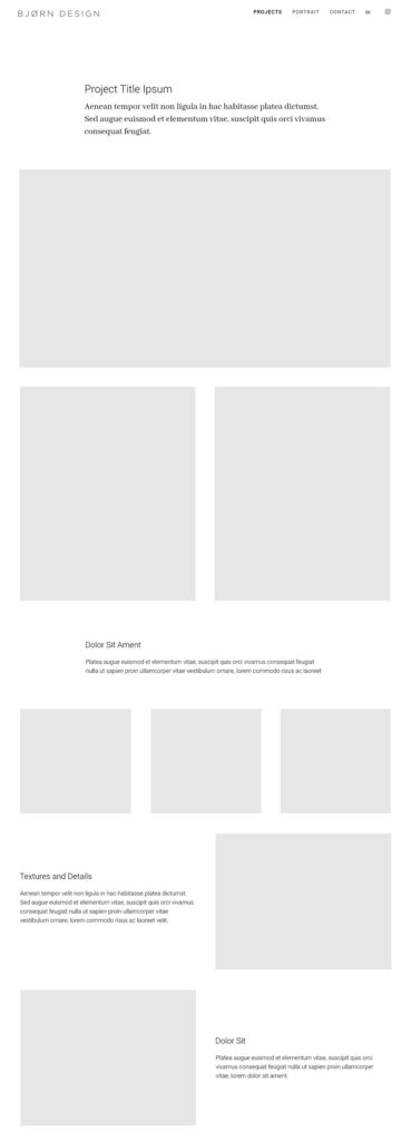
In the end, we decided on a radically limited layout palette, with programmer Gwyn Fisher creating a custom row block for the site with 7 choices that can be deployed in any order:
- Intro text
- Full width image
- Two-up images
- Three-up images
- Left text right image
- Right text left image
- Subsection – interstitial text.
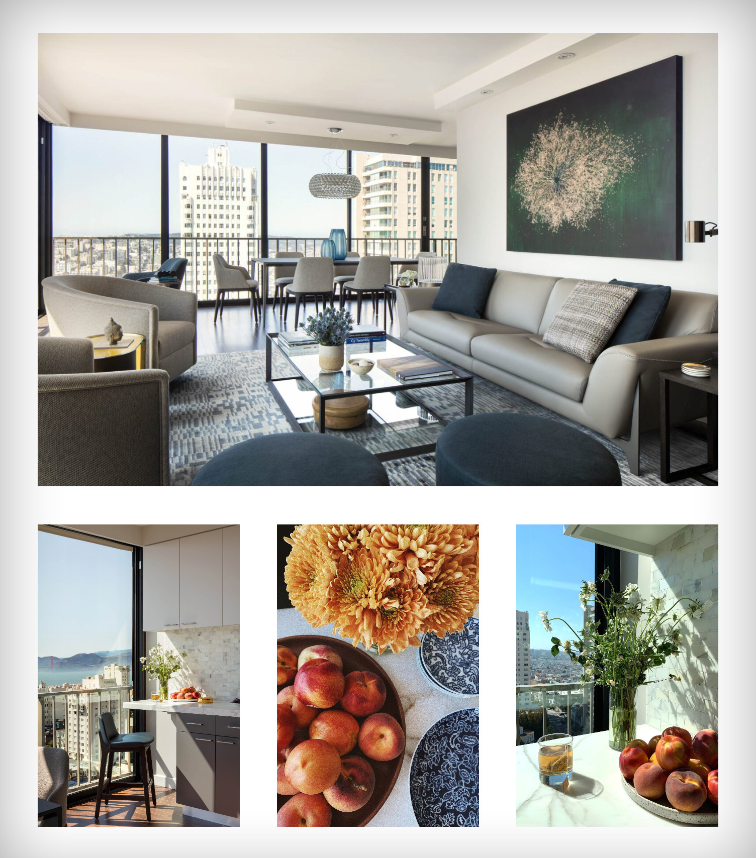
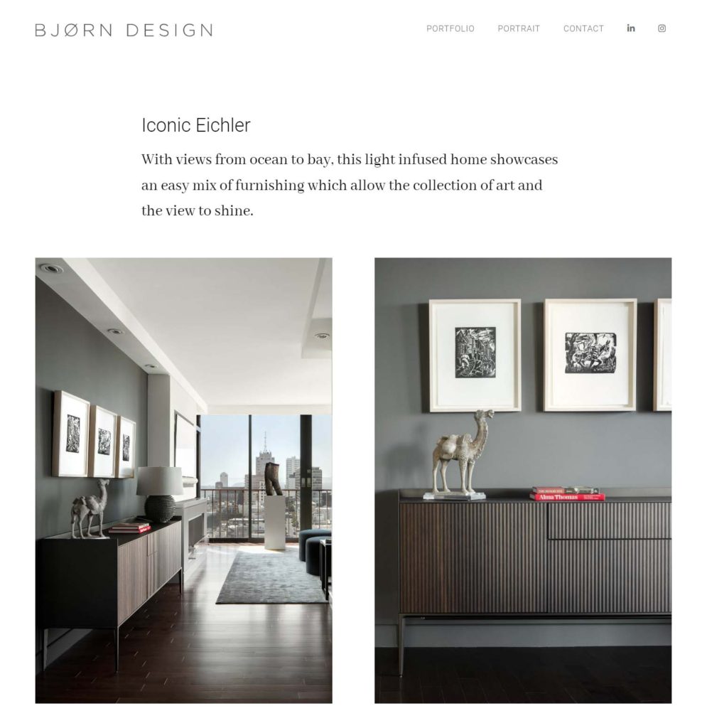
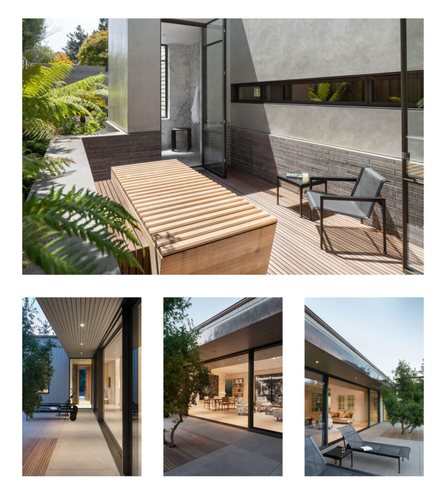
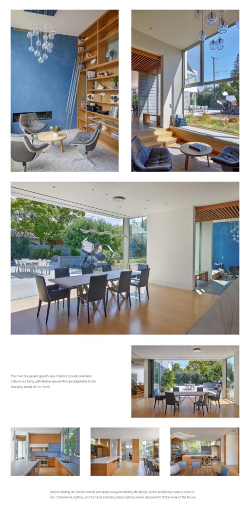
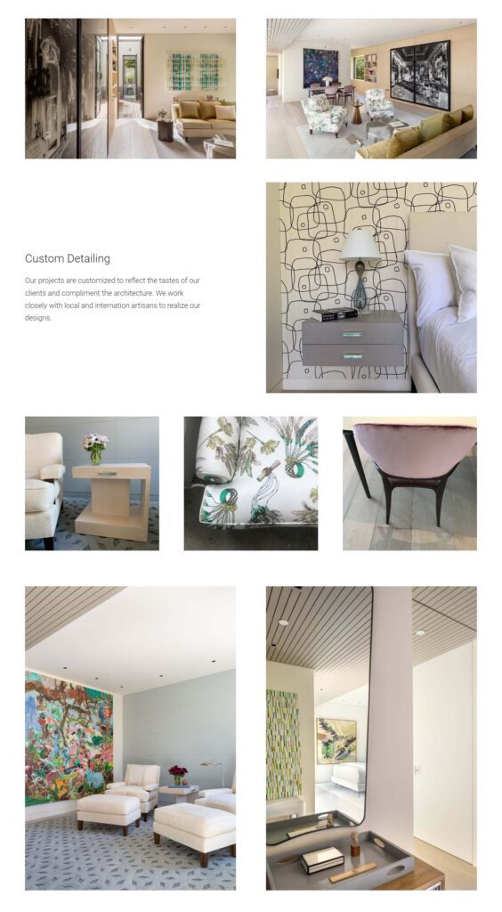
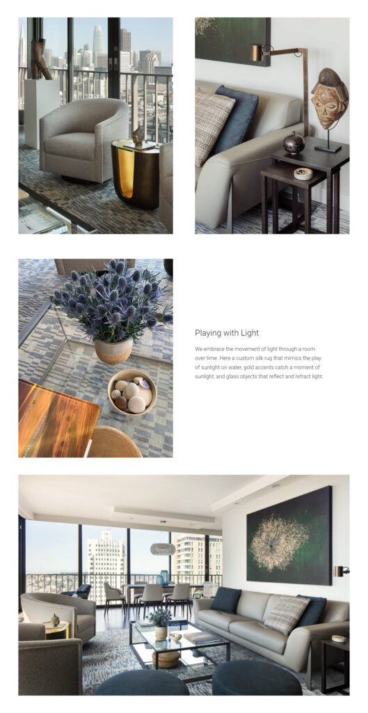
You can see these row options at right. In 2- and 3- image rows, images are cropped to matching height, and can be any aspect ratio, so square images, portrait images, and landscape images all work and give additional variety. This makes these simple elements combine into very unique and clean layouts that let us tell the story of any given project.
The custom block lets you choose which style for each row you create, with simple options to add text and images:
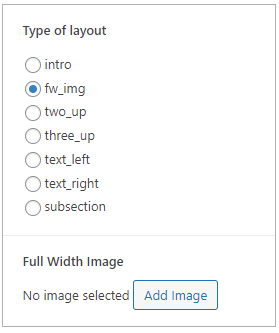
The block lets you enter text and headlines, but keeps all formatting styled with sitewide CSS, so updates to spacing, font size, etc, can be made globally at any time to the whole site.
The results are great magazine-style stories that show off Bjorn Design’s work, while the tool constrains the choices to ensure consistency over time.
These pages are best viewed full size in a browser, but here are some screenshots give you an idea of the flexibility and beauty of the plan:
See the full site and read the story of these great projects at bjorndesign.net