The fun of site design for a team of architects.
I’ve always loved working for visually creative clients. The images are the bedrock of the design, and as website designer, I want to use them to their best advantage, make the site easy to use, and get out of the way.
I designed the website for RMW Architecture & Interiors in 2012 and 2013. Working with architecture communications guru Kenneth Caldwell, we helped bring the firm’s people and stories to the fore, showing how the team behind the work was as interesting as the end product. The website tied together people, stories, clients, and work with interesting interrelationships.
This year, for their 50th Anniversary, RMW rebranded. San Francisco–based graphic design studio Stout helped transform the firm’s complex legacy logo into a “through line” that connects the R, M, and W, suggesting there’s no exact start or finish.
The new RMW website keeps its interconnections and focus on story, but simplifies the fonts and structure, paring them down to the essentials. The initial plan was to follow a simple grid and emphasize a 16:9 image ratio, but as we progressed, we realized we had to adjust. As RMW associate principal Hakee Chang told me, “architects love to create rules, put them in place, then see where things need to adjust.”
In other words, the grid was strict, but we cheated, too.
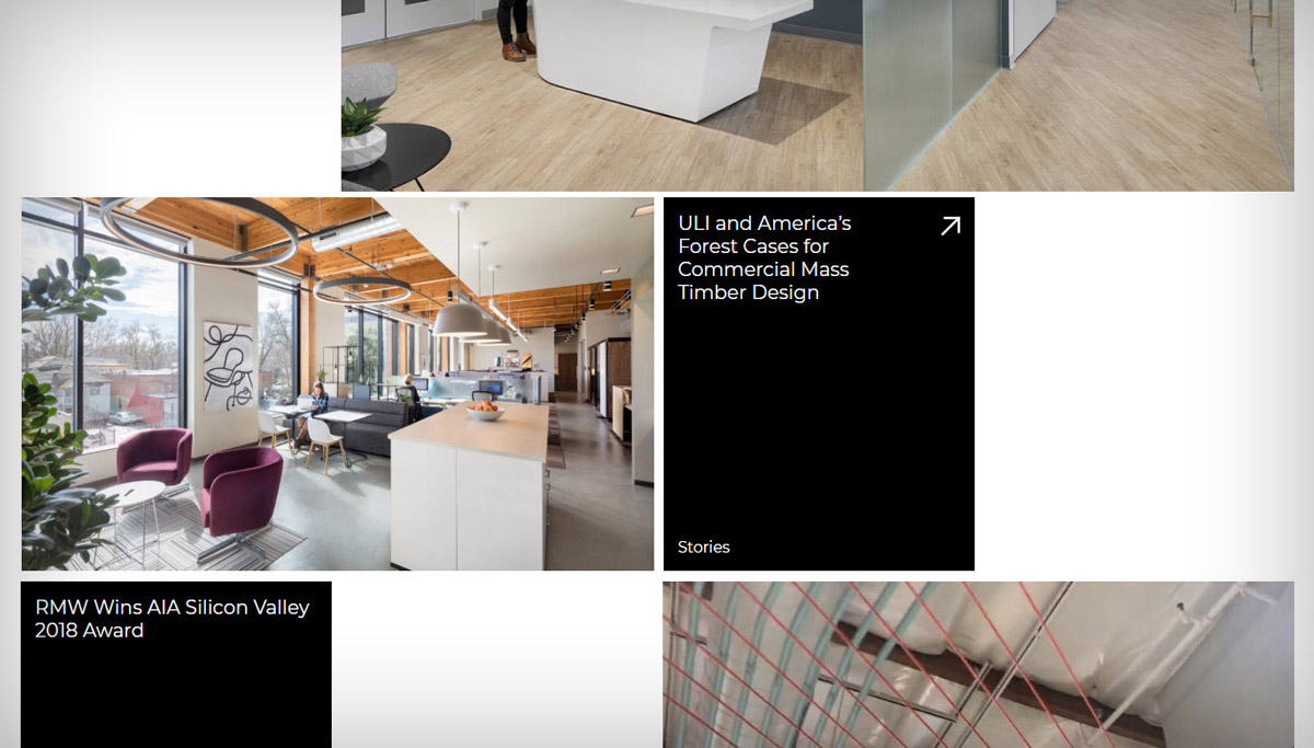
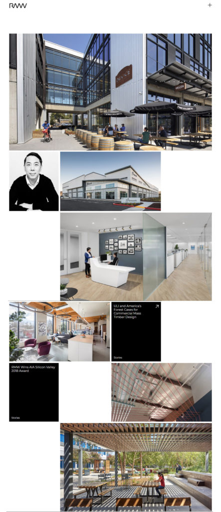
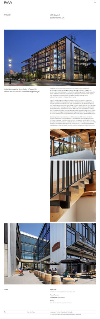
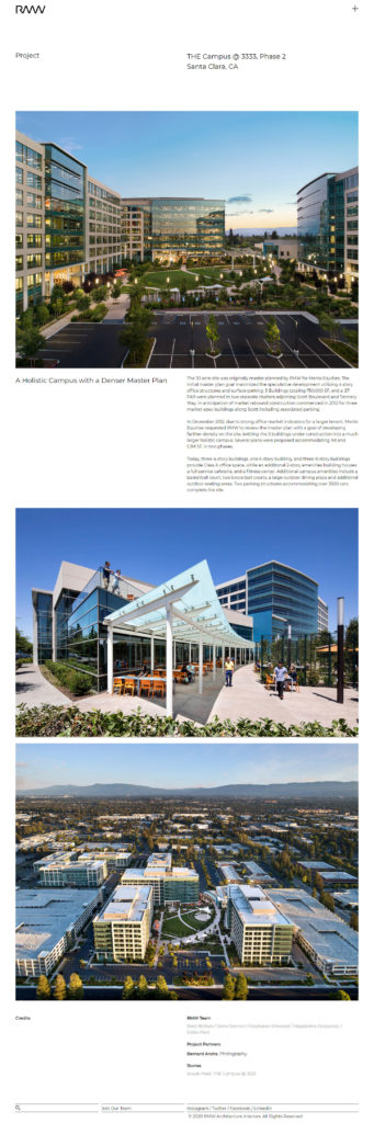
The Home page is a four-column grid, with the height determined by the 16:9 ratio of full-width, three-quarters-width, or half-width images. Then Project pages use a two-column grid.
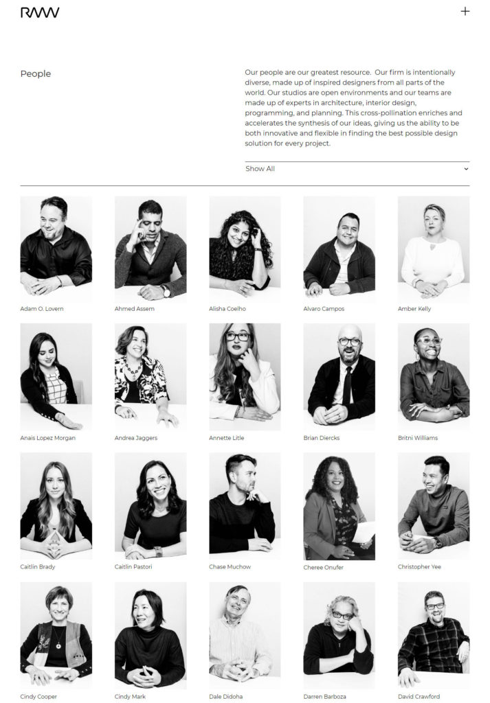
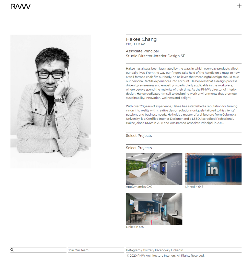
Candid, fun new staff portraits were shot at 4:6 and inspired a different grid for the People page. The bio pages for staff members were initially going to follow the two-column layout, but on full screen, the images were too large, so we cheated the left column to balance the page.
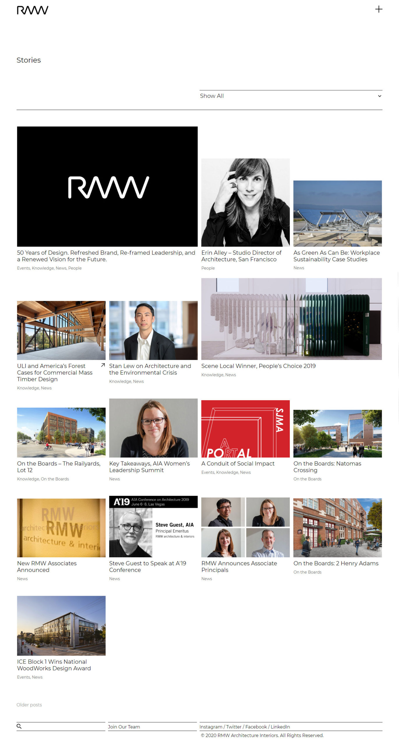
Finally, the grid for the Stories page, four columns across, reached its groove when we introduced larger images, and principal Caitlin Pastori had the inspiration to align the headlines but let the image heights vary. The result is fun and unusual, in a slightly different take on the story grid:
See more at rmw.com.