For 20 years Neutraface felt like a can't fail choice.
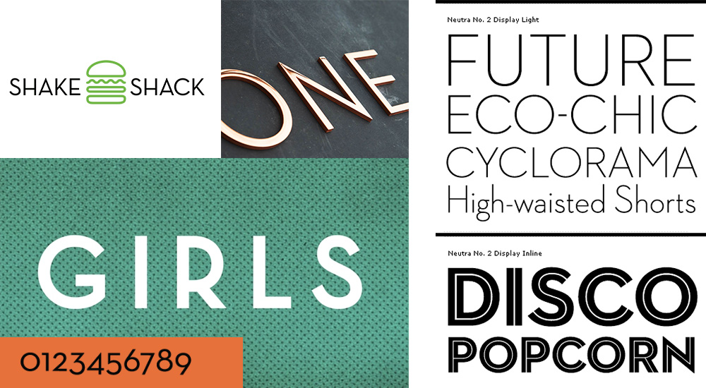
Based on architect Richard Neutra’s midcentury signage, Neutraface is open, unobtrusive, and elegant. It’s no surprise it quickly became a go-to for luxury brands. But its simple clean lines work in a surprising variety of places. Burgers? Cars? Movie posters? Cologne? Sure.
For years, I’d show a client 5 logo options, and the one set in Neutraface would be the winner every time.
Revered by designers and font enthusiasts alike, it’s a typeface that pays homage to the mid-20th century modernist movement while embodying a contemporary vibe. The font has this magic callback to something we know we want, but can’t quite name.
Unlike a lot of briefly hot fonts, Neutraface has had staying power. The Guardian’s piece The gentrification font: how a sleek typeface became a neighborhood omen looks at how the house numbers set in Neutraface and sold by Design Within Reach have come to stand in for a whole upscale trend in housing. I’m not in favor of poorer people being pushed out of their neighborhoods. But there is a joy in seeing new design trends, on websites or fence styles. Just when you think there’s nothing new, someone swaps to horizontal wood planks. Who would have thought?
But back to Neutraface. It did get overexposed. It’s on Wendy’s fast food labels, soap, movie posters, and facial tissues. More than a decade ago some nerdy designers created a spoof of Lady Gaga’s Pokerface, Neutraface : An Ode On A Typeface. When a font is so widely used, it can start to lose its originality and impact. As more and more people encounter the font in various contexts, it may begin to feel less unique or fresh, and certainly I’ve moved away from it, and use it sparingly.
But I have very fond memories. And still, from time to time, you need a 40s / 50s elegant nightclub sign or face cream label. And there’s nothing else that will do.
It reminds me it’s time to reread the book “Just My Type: A Book About Fonts” by Simon Garfield. It takes readers on a journey through the evolution of typography, discussing the stories behind iconic typefaces, their creators, and the cultural influences that shaped them. I’ve blurbed it before, but think it would be worth revisiting.
Neutraface is published by House Industries. Please use your fonts legally.